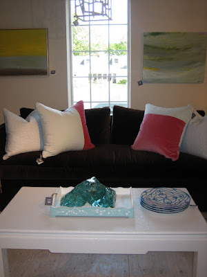
Hampton Designer Showhouse: Great Room by KA Design Group

The Great Room designed by KA Design Group at the Hampton Designer Showhouse was also one of my favorite rooms. I think mostly because the design is what I wish we could have done to the Hamptons house I worked on last summer. It's full of really great textures and colors that act as a wonderful backdrop to the drop dead gorgeous art! According to the designers Kenneth Alpert and Andrew Petronio, they designed the Great Room in a style that is the "softer side of modern."

I really love the center table in the room that seems to anchor the room and can be used for meals or games as well as display.

The color scheme is chocolate brown and white with pops of pink. The walls are a beautiful Venetian plaster that reflects the light while the chocolate brown upholstery on the chaise chairs has a great nap that absorbs light. The pink curtains are a hot pink taffeta that help set the stage for the "eclectic blend of modern antique furniture."

Here a small Julian Opie sculpture perches a top a marble topped side table.

My absolute favorite aspect of the room are the three large Bing Wright photographs that extend the room like windows. The wicker furniture also reminds you that you are near the beach.

The designers were able to borrow an amazing collection of art from Salon 94 including two Marilyn Minter photographs, one of which is seen in this vignette.

You can see an example of another natural and traditional material used in a novel way in this room. The grass cloth was cut into squares to cover the cover ceiling and is juxtaposed with a very modern light fixture.

This room is probably not what people would immediately think of for a beach house but it illustrates that there are different styles for different people. I like to think of this room as what an art collector who lives in Manhattan might want live when they are away for the weekend. And you can certainly take a lot of great ideas from this room for your own home. Bon Weekend!

Photos by Heather Clawson

Bachelorette Pad Update

We interrupt our Hampton Designer Showhouse coverage to update you on what 's been going on with my bachelorette pad. I was there today to accept delivery of the new faux-bamboo etegere that I found last week at Elizabeth Bauer. The original plan was to replace her existing short bookcase with a taller one and we discussed the Oly Stella Shelf but this one was less expensive and works perfectly with the artwork. Sometimes it pays to wait until you find the right piece.

A few people have been asking me to post more about my work and I'm going to make more of an effort going forward but it's hard to show photos if you have any hope of getting a project published. Someone actually stopped by the bachelorette pad today to scout it for a photo shoot so hopefully you will be seeing the entire finished apartment published in a few months. I don't think this photo will ruin anything though because we still need to buy accessories and I will restyle the bookcase. A decorator's work is never done!

bachelorette pad before

Hamptons Designer Showhouse: Rooms by Katie Ridder

Sometimes it is the smallest rooms in a showhouse that make the biggest impact and that is definitely the case with designer Katie Ridder's butler pantry and bathroom in the Hampton Designer Showhouse this year. She is lucky that she had her own great line of wallpapers to choose from but how many people would really wallpaper a butler's pantry in real life? Usually they are such a small room that they get overlooked in the design process but with this bright cheerful paper, it becomes a jewel box.

One of the other designers in the house mentioned that she at first felt sorry that Katie Ridder got such small rooms but clearly she managed to do a lot with the wallpaper and accessories.

When you walk down the hall, the room makes you smile as you walk past it.

It's hard to photograph powder rooms well but you can get a sense of how cute the sailboat paper looks in a house by the beach! Small rooms are great places to make a big impact with wallpaper and take chances with pattern because there is less of a chance of a homeowner getting tired of the design since they see it in small doses.


Photos by Heather Clawson

Hampton Designer Showhouse: Dining Room by Marshall Watson

The dining room at the Hampton Designer Showhouse is directly to your right when you enter the house and Marshall Watson has created a fabulous room to greet visitors! According to his description of the room, his firm decided to take the architectural details of the room down a notch by adding "rustic textures and natural linens, accompanied by both vintage and antique furnishings that command a strong presence."

There were a lot of wonderful details in this room including the English oiled walls, the monogrammed slip covers/place cards on the Spanish chairs, and the natural edged table.

I often see dining rooms in real life that look unfinished because no thought was ever really given to them since they are rarely used but this room doesn't leave any wall empty. The art and furniture around the sides complete the overall design wonderfully and make it look like a room you would want to use everyday!

There were a lot of lovely flower arrangements in the showhouse.

The most unique element in the room is the light fixture that lighting designer Mark Figueredo (MF Custom Lighting and Design, 631-329-5033) created from "bee skeps." It adds that natural element that any house near the beach should have to make it feel a little more casual.

At first I thought the wired flatware was part of the design until I remembered that sometimes showhouse visitors think they should be able to take home a souvenir. That happened to designer Garrow Kedigian at the Kips Bay Decorator Showhouse this year and he was very upset because the item taken was a sentimental object picked up in Paris. So this is a good time to remind everyone that the designers who participate in showhouses often borrow items from showrooms or their own homes and they must be returned so please do not steal anything! If you need a fix, you can always buy something at the gift shop!

UPDATE: I came across this great article today by Marshall Watson that describes exactly how much work goes into participating in a showhouse!

Photos by Heather Clawson

Hampton Designer Showhouse: Plans

The Hamptons aren't like any other place in the country. The houses are not only bigger and more expensive but even the ones not actually on the beach are expensive! I thought before I moved onto to any other rooms, you might want to see the actual house and it's plans. For those who aren't familiar with showhouses, all of them are put together to benefit a charity. The Hamptons Designer Showhouse this year benefits the Southampton Hospital. They are also always staged in a house that is for sale. In this case, it is a 8,500 SF spec house that was designed by Farrel Building Company. Oh, it can also be yours for $8,450,000.

Joe Farrell had always dreamed of building homes and in 1995 he left his lucrative position on the New York Mercantile Exchange to start Farrell Building Company. They are committed to superior craftsmanship and it definitely shows in this house. This house on Davids Lane in Water Mill is slightly smaller than the Hamptons house I worked on last summer but this one is much better thought out and has much more reasonably sized rooms that actually feel cozy. We all agreed that they did a great job with the bathrooms too.

Just wait until you see inside the two floor pool house that was completely designed by Lilian August!

The pool is a little small but I could make due with it! You might notice that the house abuts a corn field. A lot of the farmers sell their land to developers for more than they would ever make farming.

The first floor has a great entrance that allows you to see straight through the house when you enter. It does have the screened in porch but no other covered porch areas which would have been nice.

The second floor is made up of a master bedroom suite and four bedrooms. When I post the rooms from the Showhouse, I will try to match them up to the bedrooms on the plan. There is also a finished basement with another six rooms. Sigh. The rich sure do have it nice! I wonder if they noticed if I moved in for the rest of the summer!

Hampton Designer Showhouse: Screened Porch by Brad Ford

This year's Hampton Designer Showhouse was very impressive and inspiring! We kept declaring each room we visited our favorite and the screened porch designed by my friend and fellow blogger and designer Brad Ford was declared a favorite by everyone who has seen it according to the ladies in charge. I spoke to Brad and he said that when they were walking through the house looking at the rooms before they were assigned, he knew right away that he wanted the screened porch since it reminded him of his home in Arkansas. He said, "I've always been influenced by nature and natural resources and the room really resonated with me."

After he officially had the room, he began to think about what classic ideas are associated with a porch and his first thought was a porch swing. But of course since it was not only for a showhouse but a showhouse in the Hamptons, he had to take it to the next level. He custom designed the upholstered swings and even though the concept is very strong, it's also very simple and elegant. Brad also said, "I didn't want to take away from the amazing view." The soothing neutral colors definitely don't interfere with the view outside and along with the gentle movement of the swings, they make the room very relaxing. Exactly how you want a house in the Hamptons to feel!

The second idea that came to Brad's mind when he was thinking about a summer porch was wind chimes. And again, not just any old wind chimes, they needed to make a statement! He remembered an artist, Jennifer Prichard, who worked in porcelain and contacted her to see if she would be interested in working on his idea and she immediately jumped on board. She agreed to make about 800-1000 cones that would be hung from simple twine. If you visit the house and look at Brad's original concept in the program, he designed the wind chimes to hang from the ceiling but once the swings were in place, he didn't want to take away from them so he decided to move the chimes to the back wall. They were to be assembled on site so it was easy to make the switch although it took them a day and a half to actually install them all. They look like a fabulous art installation and do actually chime if the wind blows.

Brad added a lot of thoughtful details throughout the room that he said really came together at the end. The mirror which is wrapped with rope was designed by Christian Astuguvielle and is available through Holly Hunt and the sea grass area rug add more natural elements, as do the wooden tables from Tucker Robbins. He had also seen the photo of the Tribesman (below) at the Clic Gallery in New York and knew he wanted it for his room. The photo and the Tucker Robbins tables that were made in Africa, started to lend a primitive feel to the room but all of the elements work perfectly together. A couple of other designers have African pieces and great art in their rooms so this year's house has a really great flow and I can't wait to post more of the rooms!

Brad Ford is not only a wonderful designer but a really wonderful person who has stayed true to his Southern upbringing and he will also be featured in the September issue of Country Living! Look for it on newsstands soon and please stop by the Hampton Designer Showhouse and see his beautiful room!

Hampton Designer Showhouse
179 David's Lane
Water Mill, NY
July 26- September 6, 2009
11:00am - 5:00pm daily

Photos by Heather Clawson

50 anos de tatuagem no Brasil comemorados com muita arte

O dia 20 e Julho é considerado o dia nacional do tatuador, este é o dia em que o tatuador Luck Tattoo, nascido na
Dinamarca, chegou ao Brasil cinqüenta anos atrás.

Esta feita é comemorada pela quinta vez com a Exposição de Arte "50 Anos da Tatuagem no Brasil". Trata-se de uma realização do Sindicato dos Tatuadores em conjunto com tatuadores associados. Desta vez o aniversário de 50 anos da tatuagem no Brasil foi comemorado na Morrison Rock Bar, em São Paulo.

A Exposição de Arte 50 Anos da Tatuagem no Brasil reuniu tatuadores, tatuados e apreciadores da arte em um espaço muito agradável, com exposições de pinturas realizadas por tatuadores e muito Rock and Roll.

Os tatuadores Brian, Brinquedo, Alex Cruz, Cubano, Rodney Calfa , Sharlão, Valderramos, Marcio Lima, Salim Tattoo, Tom Tattoo, Brice, Fabião, Marcio Duarte, Anselmo, Ximenes Tattoo, Joe, Flávio Cabelo, Alessandro, Jefferson Bastos, Willian Ferramosca, Grylo Tattoo, Átila e Poeta foram alguns dos artistas presentes neste grande encontro.

Esperamos ansiosos as fotos do encontro no fotolog do Dia do Tatuador e deixamos os parabéns à todos os tatuadores, tatuadoras, tatuados e pessoas envolvidas com o mundo das tattoos. Fica o convite para a matéria sobre Dia do Tatuador publicada no dia 20 de Julho de 2008.

Hamptons Designer Showhouse

I'm off to check out the Hampton Designer Showhouse today with my friend and fellow designer Kevin Isbell. Be sure to check back later for the full scoop!

What's in the box?

Apparently the rumors about the demise of the recession might actually be true, or at least on Madison Avenue, where Hermes is building a new men's store across from their flagship boutique. I always knew women weren't the only ones who liked to open those fabulous orange boxes! C'est magnifique!

Connecticut Classic: HB Home

While we were in Westport, we also stopped into HB Home. I've been seeing their very chic ads in magazines for a while so it was finally nice to see them in person. The shop is an extension of the design firm Healing Barsanti. Add them to your list of places to visit the next time you venture to Connecticut!


Photos by Heather Clawson

Habitually Chic Field Trip to Connecticut!

Recently, interior designer Allison Caccoma was kind enough to invite me along for a little field trip to Connecticut and of course I jumped at the chance to get out the city for a day! First we met with the wonderful team at Moffly Media in Westport who publish a bunch of great regional magazines for the Connecticut area. I especially loved AtHome which I begged them to bring to New York and/or the national market. We could use some new home magazines!

After a wonderful lunch, we hit the amazing stores! My favorite was definitely Dovecote! It was full of great new and vintage furniture, books, accessories, candles, jewelry and more. When we arrived they were in the middle of restyling the store so I want to thank them for quickly putting things together so I could take some photos for you. If you have not been to this store in person, you must get there soon! You will find great pieces for your clients and also yourself! If I owned a store, I would want it to look and feel like Dovecote! You can check out what I bought at the end! Happy Shopping!

Dovecote
56 Post Road East
Westport, CT 06880
203-222-7500


Photos by Heather Clawson